

Business Problem
As more and more people are interested in buying a Tesla, our sales team could not attend to all the calls fast enough, which frustrated potential buyers.
The Ask
A proactive chat that will prompt users to chat.
My Approach
I started with going through the existing chat experience myself. Right away, I knew that I wanted to improve the look and feel of the interaction and UX to reflect the Tesla branding. Although the ask is “A proactive chat that will prompt users to chat,” I recommended to my PM that it would be more valuable to improve the end-to-end experience.
Before


Understand and clarify the problem
As the sole designer on the project, I'd partner closely with a PM and Sales expert. After our initial meeting, I have sent out these questions to uncover our sales team's needs and their end-users pain points. In addition, their answers will help clarify the requirements and scope of the project.
Do we need a Pre-chat form?
After collecting customer contact info, can we suggest a list of questions users can ask?
Rate the experience after the chat ended?
Send Email chat history?
Do we want customers to share pics or attach files with us?
How long do customers have to wait to receive a response after initiating the chat?
What can we do when the chat gets disconnected for various reasons in the middle of the conversation? Should we let the customer pick up where they left off? If customers have followed up questions later, how would we handle these situations?
How many customers can a sales associate communicate with at once?
Do we accept offline messages? or Add customers to the waitlist?
Should we favor customers who have quick questions? How do we identify that?
After receiving answers to these questions via email, we synced virtually to define scope and the timeline.

Design Handoff
I mocked up the screens with a simple user happy flow since we have a week's deadline. The design goal is to make the chat box fit nicely across mobile and website pages.

Screenshot Sketch Design file
Design Overview

An Icon that is visible on Dark & Light
I have carefully chosen the icon to ensure that it is visible on both dark and light backgrounds but not competing with the contents.
Providing a better prompt copy
Initially, the prompt message: “How can we help you” (Left Image) is too broad. Changing a prompt message to “Question about ordering a Tesla product” (Right Image) has given the user a clear direction.


Improvements that meet users and teams’ needs
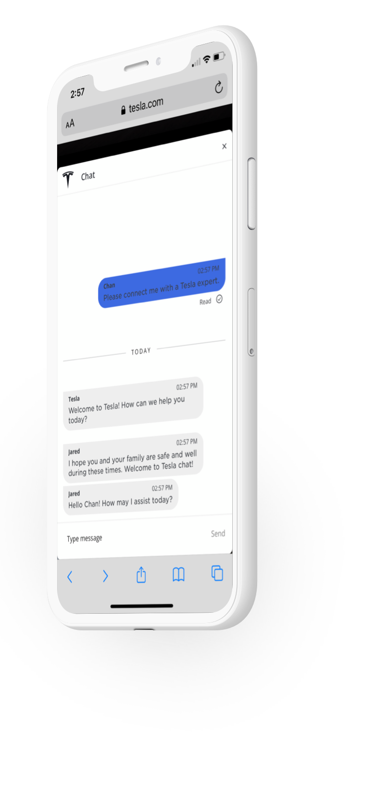
Before visitors chat with a sales expert, we provide the pre-chat form such as name, email, phone number, etc. Thus, we learn about customers before talking with them. With that information at hand, we were able to provide better customer service, increase team productivity.
The Tesla Chat is launched shortly after I moved from the team.
What I learned
Collaborating with the cross-functional team is crucial for delivering a great product. In my case, if I did not get in touch with the sales team early on with the help of PM, I wouldn’t be able to flash out the experience so quickly.
© 2022 Jue Htin